ASAPP
ASAPP uses artificial intelligence to augment, automate, and simplify the complex, data-filled problems faced by large enterprises, saving them time and money, and pleasing their customers in the process.
When they approached Focus Lab they had spent four years in stealth mode and had very little branding to date. They were seeking guidance on all things related to their brand as they prepared for a public launch. This included recommendations spanning from brand strategy and architecture, to product naming, to core positioning and messaging, to an identity design spanning both company and products.
Artificial intelligence firm ASAPP needed a brand identity that would communicate their innovative approach to customer experience before their public launch.
Our Approach
In light of ASAPP’s mission to meticulously research and develop innovative AI-Native™ products, we needed to create a brand identity experience that would embody and express ASAPP’s brand attributes of scholarly, cutting-edge, and professional while appealing to the enterprise-level businesses they serve.
Verbal Identity
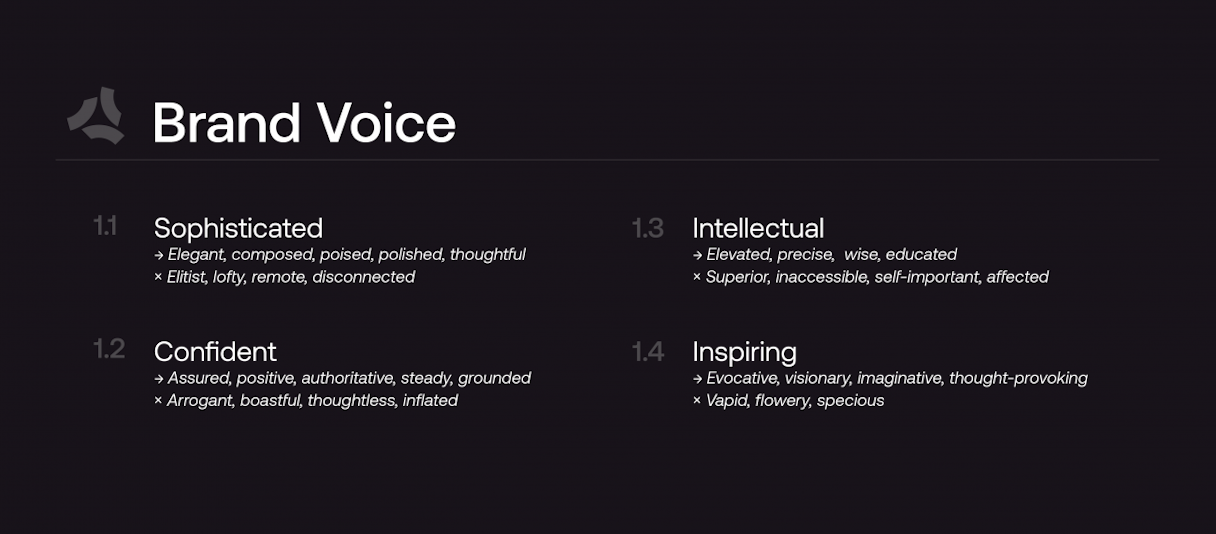
Verbal expression is an integral part of a brand experience. To help ASAPP develop and define how to express themselves verbally, we first defined their positioning and core messaging, followed by their verbal identity via voice and tone guidelines.
“Voice is about your brand personality. Tone is about how your brand delivers information in varying contexts.” - Your Brand Walks Into a Bar
The ASAPP brand voice is sophisticated, confident, intellectual, and inspiring.
After developing audienced-based messaging recommendations, we wrapped all these outcomes together in a comprehensive Communications Style Guide. The Communications Style Guide serves as a reference for their team to ensure verbal consistency in all ASAPP communications, regardless of department or individual.
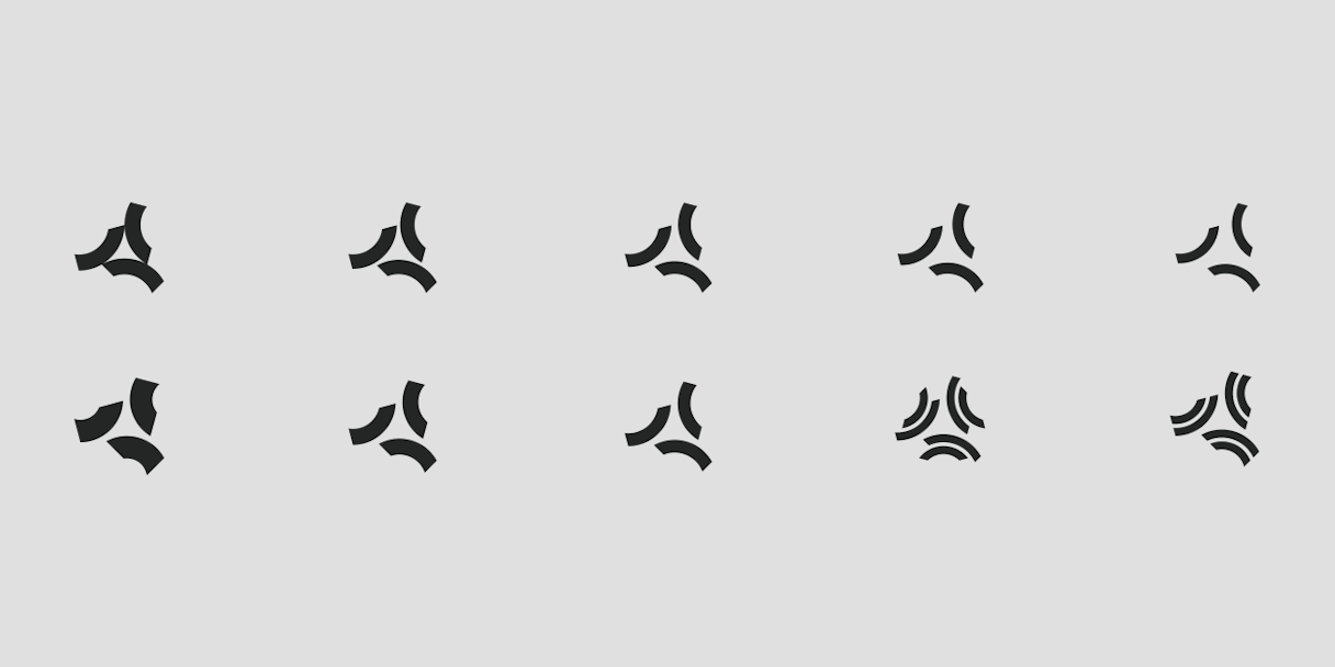
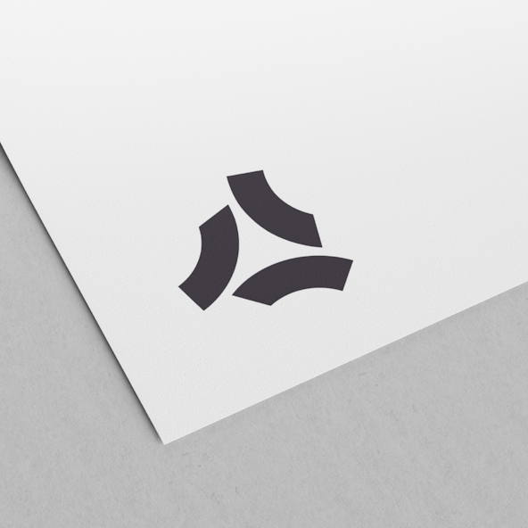
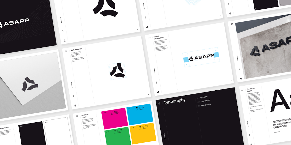
Logomark
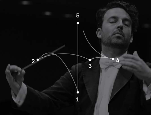
While doing research and exploring marks we unearthed a very powerful concept and metaphor for ASAPP: the orchestra conductor.
In many ways, ASAPP is a conductor, orchestrating many different moving pieces to create something beautiful through artificial intelligence. The difference between a cacophony and a symphony is the ability of a great conductor to bring all the pieces together, on time and in tune.
Over weeks of refinement, it came to mean even more: an abstract A represents “Automate,” “Augment,” and “AI-Native™.”

Visual Language
To develop a holistic brand system, we consistently referenced scholarly, cutting-edge, and professional–ASAPP's brand attributes–when making decisions about brand elements.
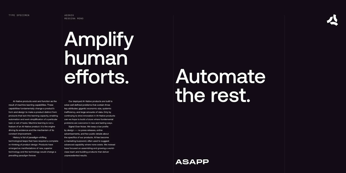
Typography: Aeonik Medium supports the brand system by providing a balanced typeface that feels comfortable with Grotesks and Geometric Sans. The monospace Messina Mono provides additional texture and a technical tone in small typographic details.
Color: Although the ASAPP brand system is primarily black, white, and grays, we recognized a need for a vibrant secondary palette for small accents, UI elements, and data visualizations. The color palette needed five distinct hues that provide sufficient contrast on black or white, and have a CMYK complement for printing.
Iconography and Illustration: The illustration style for ASAPP consists mainly of a 1px gray stroke, with very minimal color for a geometric and abstract feel. The icon style carries on the 1px gray stroke, creating a cohesive look and feel to the brand system while providing a robust framework for growth.

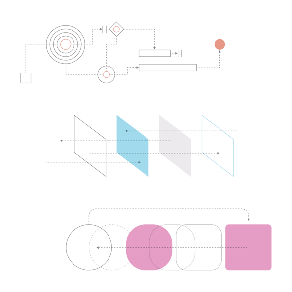
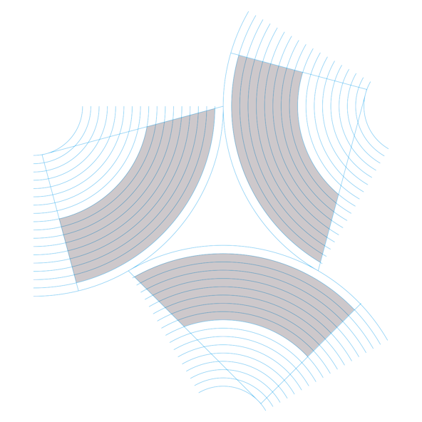
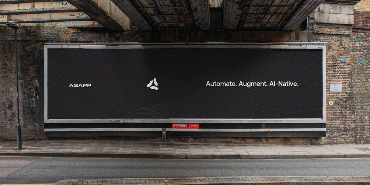
A fundamental aspect of ASAPP's approach is their brilliant research team. We wanted to reflect their research through a smart but subtle visual language that tied back to the AI technology they are creating through the visual metaphor of Vector Fields and other data visualizations.
These visuals convey a sense of an ever-moving, ever-evolving set of data points. It's this incredible power that ASAPP harnesses through their AI-Native™ technology.


Interactive
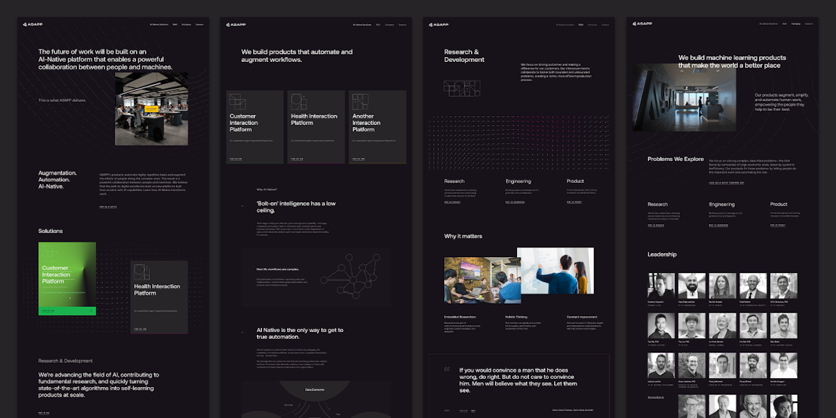
Our interactive work kicked off with an intensive onsite interactive discovery and planning session with ASAPP. After years of operating without a public face, ASAPP's website needed the momentum of a launch, without negating their years of expertise. ASAPP’s enterprise clients need to know they can trust their data to a company with a proven track-record.
We started with content strategy, deliberately creating an information structure representative of an established company, while avoiding any language that suggested “launching” or “introducing.” We worked with ASAPP on collaborative sitemaps and wireframes, which we refined before starting design, and worked through copy and content creation with their team.
Illustrations and patterns that recall data visualizations help convey both the research and refinement that is integral to the ASAPP experience, as well as the complex systems happening seamlessly behind the scenes. Pops of the secondary color palette help elements grab attention and guide the user through the established hierarchy.
A note to say thank you as we close [on a] partnership that resulted in something as innovative as it is befitting. We knew from the beginning this wasn’t going to be a simple ask, but you’ve somehow managed to capture the essence of this complex and evolving company.
Brad Stell, Head of Design, ASAPP
Post-Project Success
In the news
ASAPP Completes $185M in Series B InvestmentRead the next case study
Zello