Aptible
From credit cards to customer data, every business handles sensitive information. Security management platform Aptible exists to help startups develop processes to efficiently meet security standards and protect data from vulnerabilities.
The world of information security management can get complicated quickly. Focus Lab was asked to make Aptible's value accessible to a wider audience and deliver a cohesive brand experience as the need for security management grows exponentially.
For Aptible, we made the complex world of information security accessible and welcoming, without sacrificing expertise.
Our Approach
Aptible provides the roadmap to security compliance for their clients, guiding innovative organizations to scale their businesses quickly and safely, all while building trust. We found the metaphor of wayfinding to be a useful vehicle for expressing the potentially complicated aspects of Aptible’s identity.
Through signs and symbols, people can easily see how to travel safely through unfamiliar cities and places. Adherence to those standards doesn’t imply blindly following rules, but allows millions of people to travel with trust.


Brand Strategy
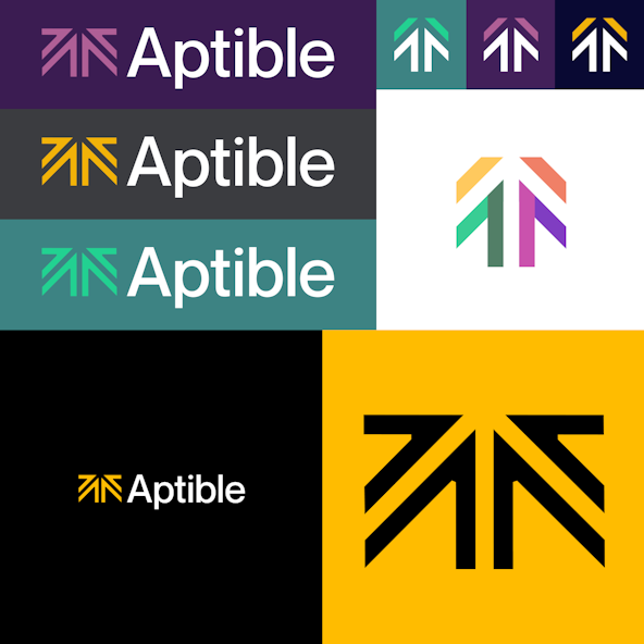
Aptible expanded quickly to meet the growing need for security management by creating two new solutions, branded as Enclave and Gridiron. But without an established brand strategy or guiding design principles, these two brands weren't clearly tied to the Aptible name. During our Discovery phase, we determined that brand equity was lost across the three brands and rebranded them as clearly defined Aptible products: Aptible Comply and Aptible Deploy.
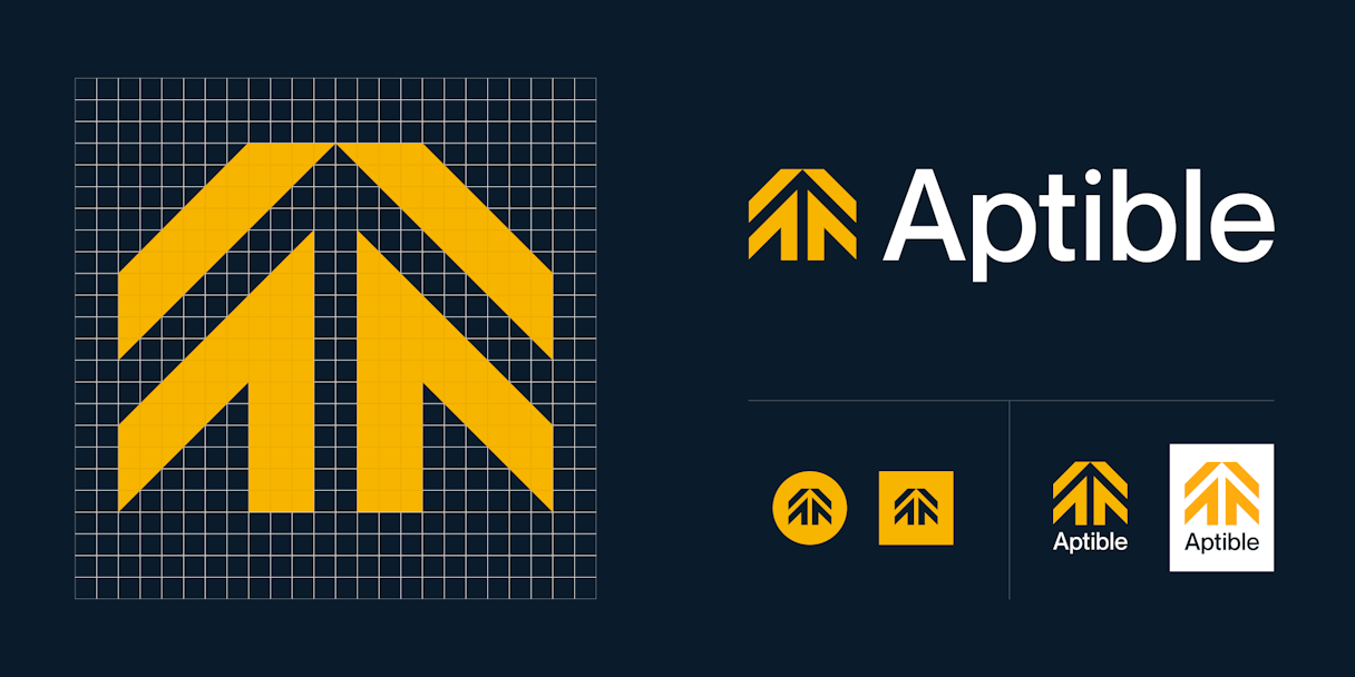
Logo
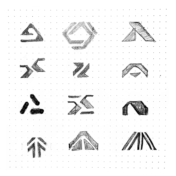
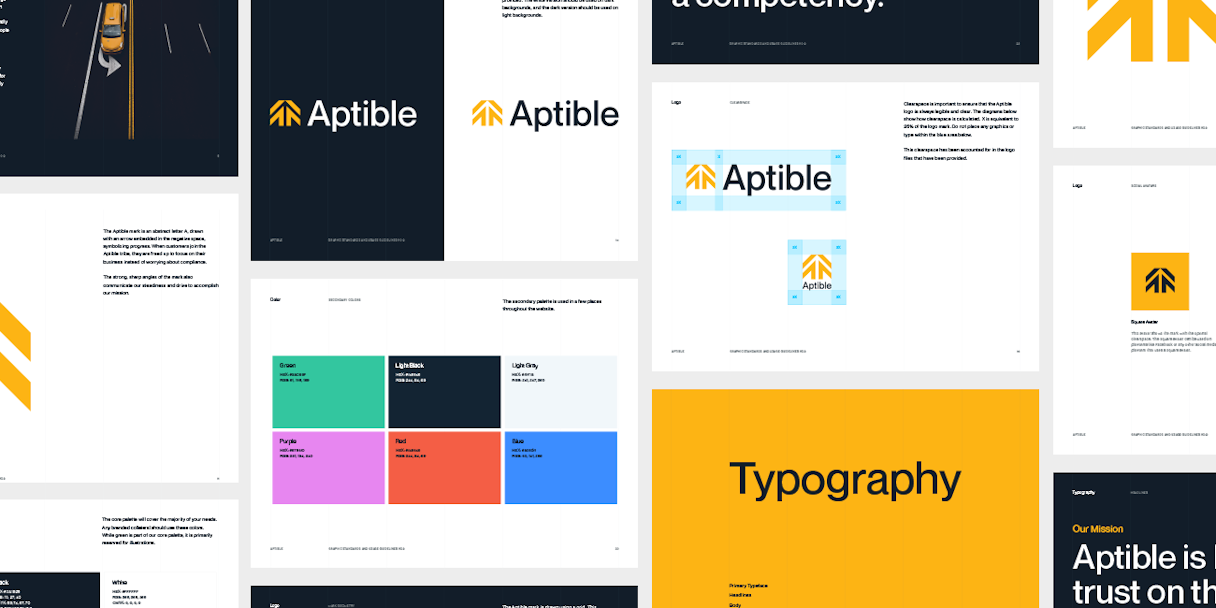
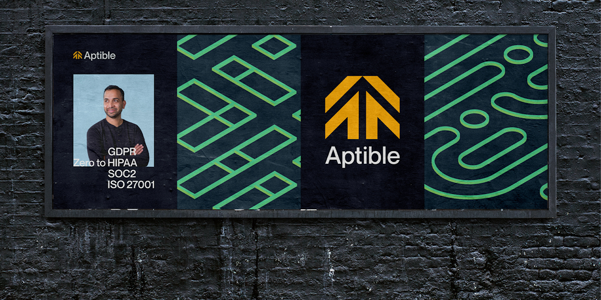
We explored marks surrounding arrows, strong angles, and a few options with dynamic components that could change based on context. The final Aptible mark is an abstract letter A, drawn with an arrow embedded in the negative space, symbolizing progress. When customers join the Aptible community, they are freed up to focus on their business instead of worrying about compliance.
For typography, we looked for a functional and stable typeface to convey trust and steadiness. We landed on Neue Montreal for Aptible's typography, with a few slight alterations for the logotype.
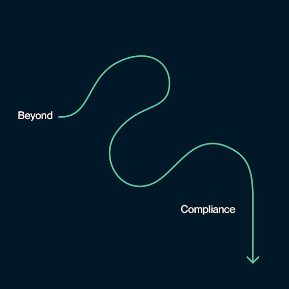
We are leading the way, beyond vulnerability. We are unlocking new opportunities, beyond bureaucracy. We are propelling startups forward, beyond compliance.
Verbal Identity
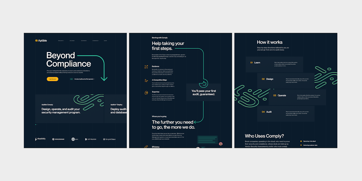
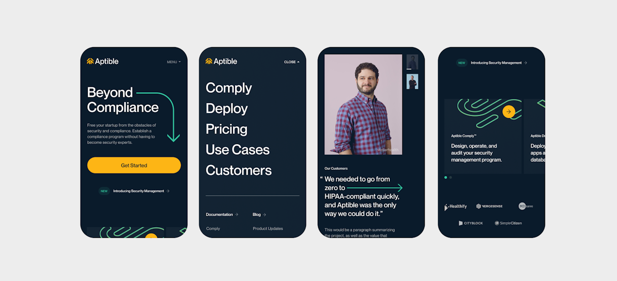
Aptible does more than meet compliance standards; it empowers customers to focus on their business. Messaging around "Beyond Compliance" focuses on the benefits outside of security management. With Aptible, startups are free to prioritize their growth and build their customer's trust.
Visual Identity
Working with Aptible, we identified their brand attributes as: Wise, Welcoming, and Steady. We sought to integrate a welcoming warmth to the Aptible brand, embodying the wise and trusted adviser. Warmer elements also acted as a welcome departure from the often sterile environment of tech startups.
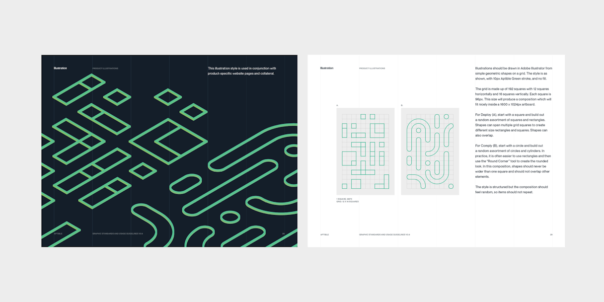
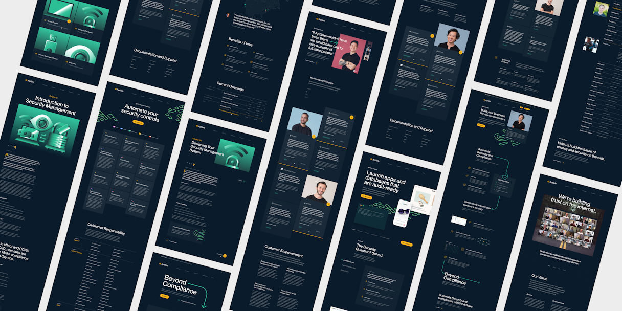
Illustrations are abstractly related to each product, created on a grid, and rotated to a consistent angle. We used circular shapes to represent Aptible Comply's highly cyclical protocols. In contrast, the illustration for Aptible Deploy utilizes squares to represent containers and databases. We further expanded on the illustration style further to create accompanying visuals for content resources.
Arrow elements from the logomark were carried throughout the identity to signify a path for users and unify experience.

Content Strategy
Content strategy supports brand storytelling within and across pages. In this instance, we needed to position Aptible as the trusted adviser without overwhelming their audience with technical details that can get unwieldy, fast. It was crucial for us to understand Aptible's multiple audiences and their levels of understanding, as well as what potential customers need to know to make a confident, informed decision. We worked with Aptible to filter down their online content to pieces of value specific to each audience segment.
Interactive
After research into competitors and the security tech space, we identified recommendations for Aptible to distinguish itself visually and avoid industry clichés, while communicating the brand's mission and values.
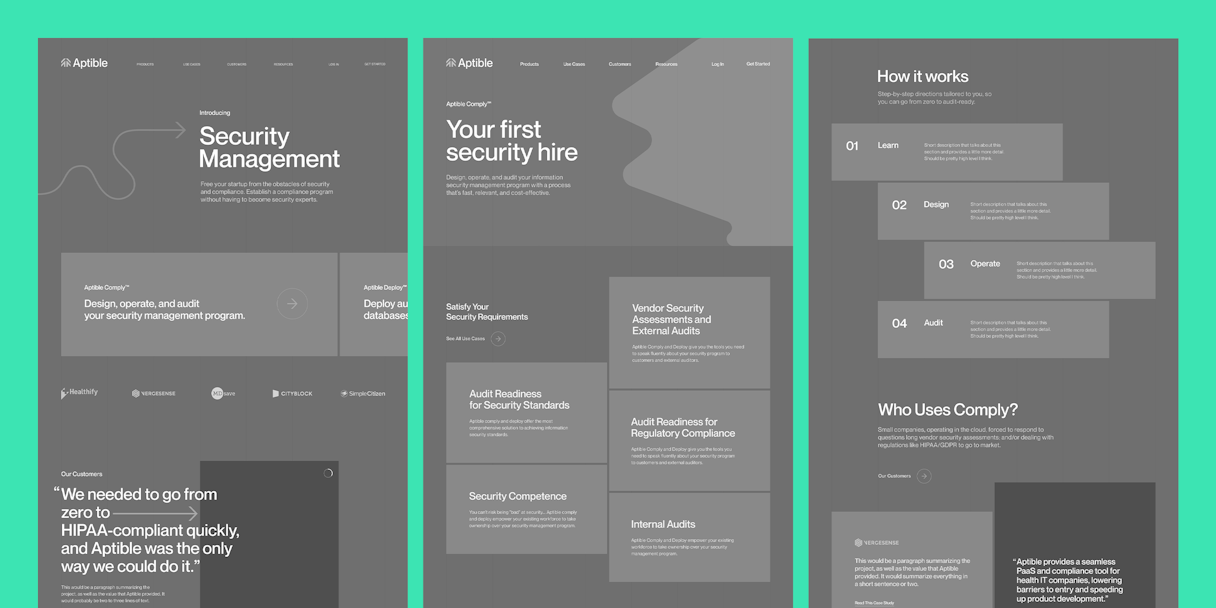
Bold typography communicates a no-nonsense functionality that is steady, classic, and will resonate with the audience.
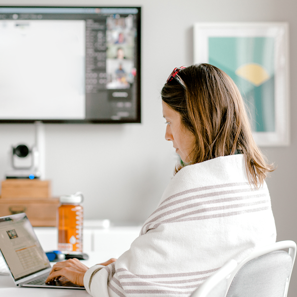
Real people in customer testimonials and throughout the site builds confidence in Aptible’s wisdom on the subject matter in a direct and welcoming tone. We developed a photo style to highlight real Aptible customers while complimenting the brand.
Darker tones provide a welcome contrast to the competition, while conveying confidence and wisdom.
Partnering with Focus Lab and investing in our brand so early in our journey has been one of the best decisions we’ve made. I can’t tell you how frequently it comes up from recruiting prospects, sales calls, to applicants for open positions. We stand out.
SKYLAR ANDERSON, VP OF DESIGN, APTIBLE
Post-Project Success
In the news
Introducing Aptible’s new brand identityRead the next case study
Deputy