Deputy
By innovating the traditional workforce management tools of the past into a single cloud-based solution, Deputy solidified itself as the industry leader in Australia. Looking to further expand its global reach in a saturated landscape, Deputy needed a brand poised to compete and distinguish itself in these new markets.
After the success of its dependable user experience and approachable personality, Deputy was ready for a rebrand that positioned it as the world-class leader within the global workforce management industry.
Our Approach
Deputy was created out of a need. As businesses grow, staffing needs multiply; scheduling shifts, managing time, tracking performance, and administration quickly become overwhelming. Deputy’s revolutionary approach to global workforce management is designed to empower both managers and their employees to live their best lives at work.
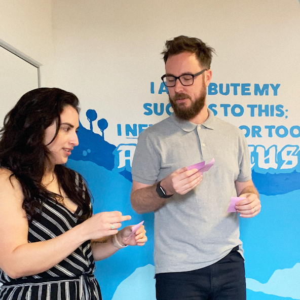
The team at Deputy really cares about helping these businesses be successful and employees feel welcomed. We got the opportunity to speak with customers firsthand in Australia and their enthusiasm for Deputy was clear. Deputy truly is the "second-in-command" for businesses and needed an identity that captured that.
Brand Strategy
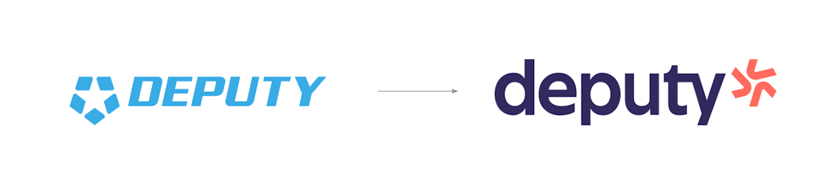
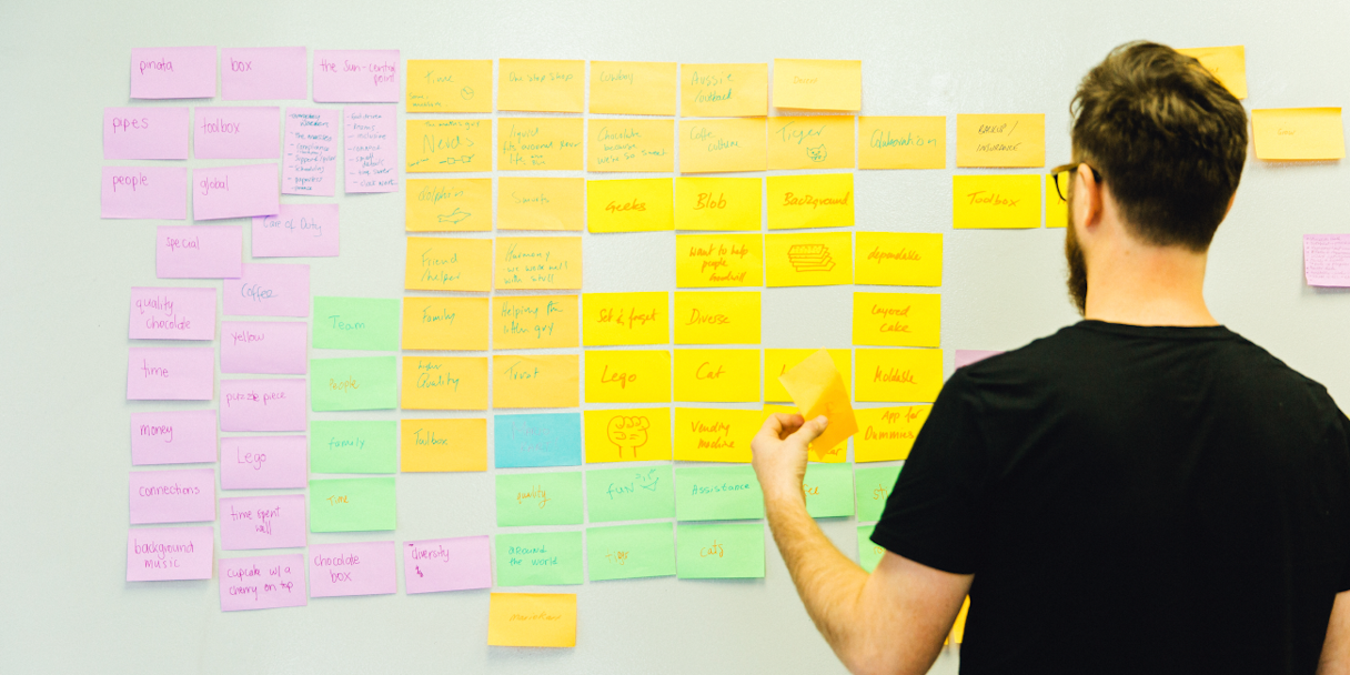
Deputy's previous mark of a deputy's badge made sense as the "second-in-command" but failed to capture the empowering and inclusive nature of the organization. Our team conducted brainstorming exercises with the Deputy team on-site and with Deputy customers in Sydney. While the love of Deputy was obvious from our conversations, the identity was less memorable and called "authoritative, intimidating." The strong italic sans-serif logotype further cemented associations with law enforcement.
Through our brand strategy work, we were able to focus our efforts on making Deputy’s identity match the empowering and exceptional ethos of the organization.
We worked with the Deputy team to define their brand attributes as welcoming, intuitive, and trusted. From there, we began to develop a narrative around "a spark" - that special piece of Deputy that makes them so unlike other workforce management solutions.
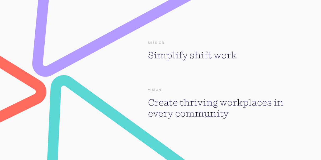
The spark represents the DNA of an individual or workplace, and it drives the Deputy team to support those thriving workplaces in every community.
A Spark
What creates a spark? For Deputy, it’s the drive they have to do great work every shift. That spark affects their customers, but it also stands for so much more. This spark fuels an inclusive workplace for everyone.

Verbal Identity
Together with their team, we audited Deputy's existing voice and tone, developed their brand messaging framework, and crafted positioning statements.
Given Deputy’s wealth of differentiators and diverse audience, positioning can be cast in various ways. First, we considered who Deputy is for, that group’s current challenges, and what makes Deputy different from the other guys clamoring for their attention. Then, we thought about how Deputy is uniquely suited to address that audience’s needs.
With all that in mind, we worked with their team to design a statement that captivates their market, resonates with their audience, and reflects Deputy.
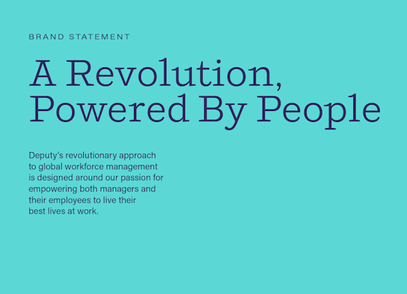
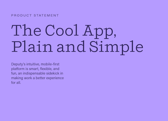
Deputy is more than its product alone, and we needed to work on two distinct statements to ensure that was properly communicated across all touchpoints.
The brand level stance is the umbrella under which the product position fits. They are separate statements, but the product statement emphasizes Deputy’s tech features, applications, and practical outcomes/benefits, while the brand statement brings big-picture qualities—mission, purpose, culture, heritage, top-level features—into focus.
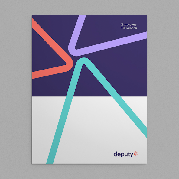
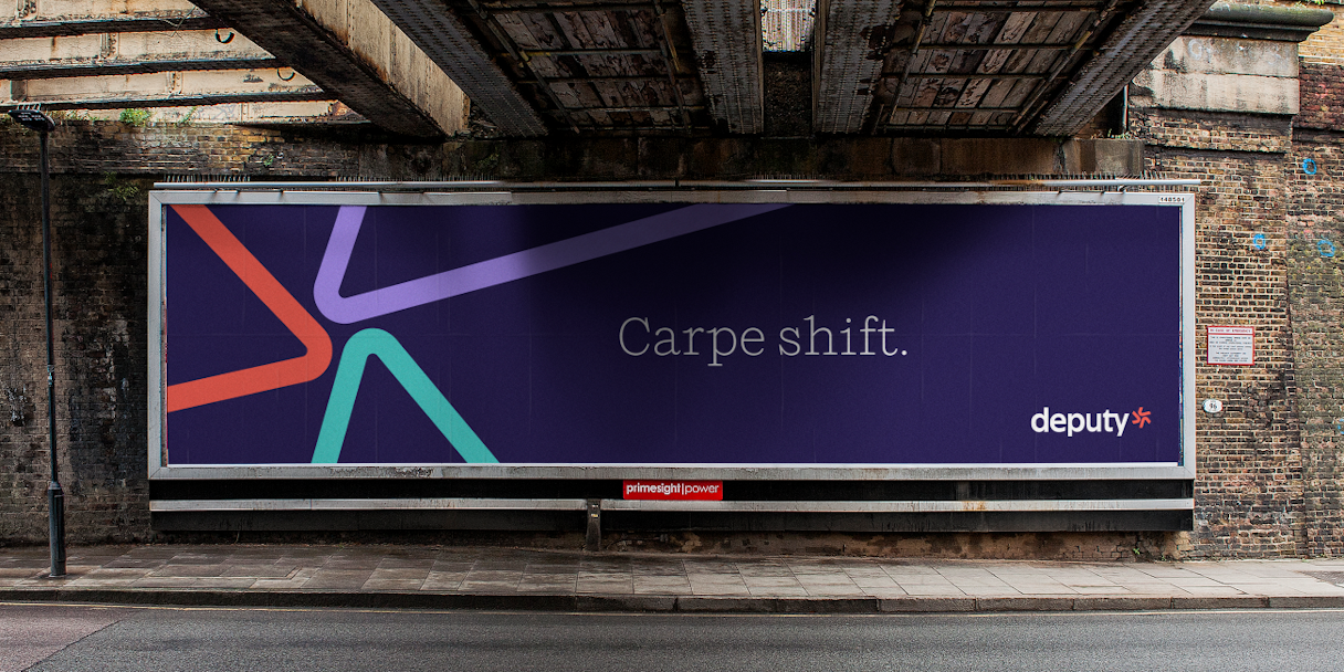
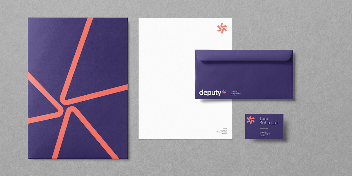
Logo
We initially explored the option of a more subtle refresh; softening the existing badge and star motif to feel friendlier. We also started with a 5-pointed spark that kept the pentagon shape of the original mark and related to Deputy's five core values.
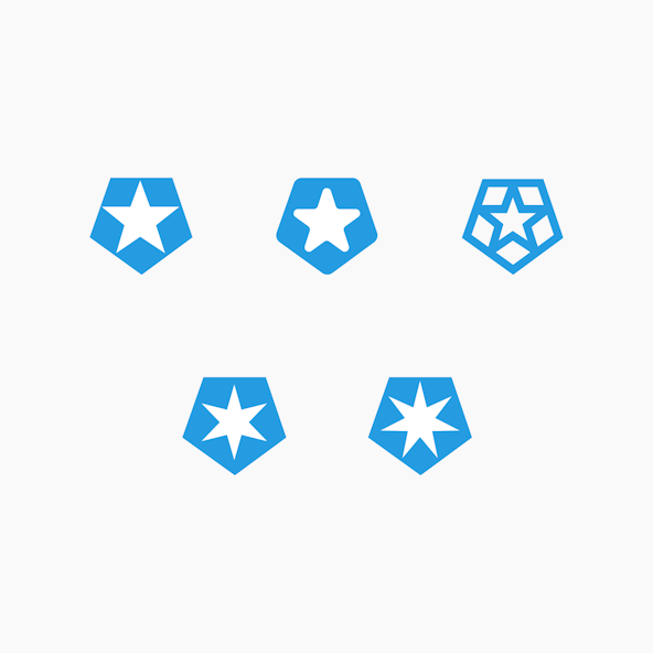

However, the three-part spark felt bolder and more ownable. The new spark has an energy and movement to it that reflects their drive for progress in the workplace. It can be used alone, or in tandem with the logotype.
Deputy’s logotype is a customized version of the typeface Nichrome.

Visual Language
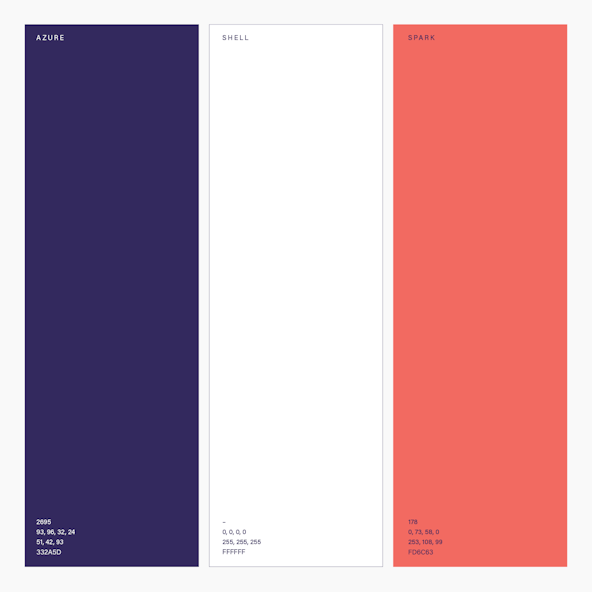
We used vibrant colors, friendly illustrations, and spark elements to stay true to Deputy's brand attributes of welcoming, intuitive, and trusted.
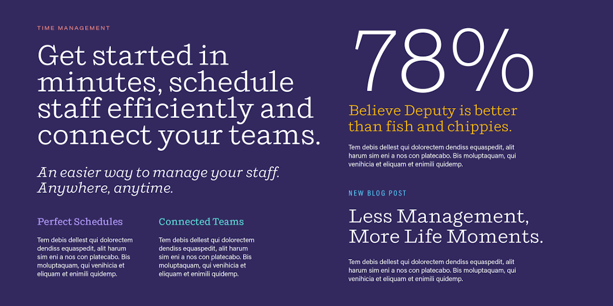
Shift is Deputy’s lead display type. It has an approachable demeanor for a serif, but also demands respect in its sturdy construction. Acumin Pro is a robust type family to be used for body copy and other small text uses.

Illustrations help add more energy and personality to Deputy's visual identity. We needed to create figures that were able to be emotive and utilize the secondary color palette. We also had to pay attention to how illustrations would work on light and dark backgrounds, as well as in branding and product experiences.
We worked with the Deputy team to provide art direction and guidance for the illustration style, which was then expanded upon by illustrator Elise Hislop for the final illustrations [bottom right].


With the foundations of our mission and values, we refreshed our brand. It’s the biggest spark I’ve felt in the 12 years of Deputy.
Ashik Ahmed, CEO, Deputy

Post-Project Success
Read the next case study
Polco & NRC